The Do’s and Don’ts of Visual Hierarchy
Visual hierarchy. It’s a term that might sound technical, but in reality, it plays a crucial role in our everyday interactions with design. Whether you’re scrolling through social media or navigating a website, visual hierarchy guides your eye and influences how you perceive information.
Imagine entering a room filled with artwork—what catches your attention first? Is it the massive painting on the wall or the tiny sketch tucked away in the corner? That instinctive response is what visual hierarchy aims to achieve in design. It’s all about arranging elements so they naturally draw focus where it’s needed most.
As we delve deeper into this topic, you’ll discover why mastering visual hierarchy can transform your designs from ordinary to extraordinary. Let’s explore the essential do’s and don’ts that will elevate your projects and engage your audience effectively!
The Importance of Visual Hierarchy in Design
Visual hierarchy is the backbone of effective design. It guides viewers’ eyes, ensuring they absorb information in a meaningful order. When elements are arranged thoughtfully, it creates a seamless flow that enhances user experience.
A well-established visual hierarchy helps convey messages quickly. In today’s fast-paced digital landscape, users often skim content. Strong hierarchy directs attention to vital points without overwhelming them.
Moreover, it fosters brand recognition and credibility. Consistent use of sizing, color schemes, and typography reinforces your identity while making navigation intuitive.
Designers also benefit from understanding how different audiences perceive visuals. Tailoring the hierarchy based on demographic preferences can significantly impact engagement levels.
Visual hierarchy shapes not just aesthetics but functionality as well—making every element count in conveying your message effectively.
The Do’s of Visual Hierarchy:
Creating a strong visual hierarchy is essential for effective design. Start by using size, color, and placement strategically. Larger elements naturally draw attention first. Use bold colors to highlight key information.
Placement also plays a vital role. Positioning crucial items at the top or center of your layout guides viewers through your content seamlessly.
Next, utilize white space wisely. It allows elements to breathe and prevents overwhelming your audience with too much information at once. A well-executed balance of text and imagery enhances readability.
Always keep your target audience in mind when designing visual hierarchy. Different demographics respond uniquely to various styles and formats. Understanding their preferences can help you create more engaging designs that resonate effectively with them.
By following these principles, you set the stage for clear communication within any design project.
– Use size, color, and placement to create a clear hierarchy
When it comes to establishing a clear visual hierarchy, size plays a crucial role. Larger elements naturally draw the eye first. Consider using bigger fonts for headings and important information.
Color also influences perception significantly. Bright colors can highlight key areas, while muted tones help less critical content fade into the background. A well-chosen color palette not only enhances aesthetics but guides attention effectively.
Placement matters just as much as size and color. Positioning significant elements at the top or center of your design ensures they capture immediate interest. Group related items together to create visual clusters that make navigation intuitive.
All these factors combined allow designers to lead viewers through their content seamlessly, encouraging engagement with essential information first before exploring secondary details.
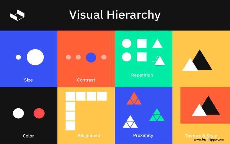
– Utilize white space effectively
White space, often referred to as negative space, is a powerful tool in design. It allows elements to breathe and creates an inviting atmosphere. When used effectively, white space enhances readability and guides the viewer’s eye.
Imagine a page crowded with text and images. It can be overwhelming. Now, picture that same content surrounded by ample white space—suddenly, everything feels organized and accessible.
Strategically placing white spaces can highlight key messages or focal points in your design. This subtle technique helps establish a visual hierarchy without adding any clutter.
Consider your audience; different demographics might respond uniquely to varying amounts of white space. Testing layouts will help you find the right balance that resonates best with them.
Using white space doesn’t mean leaving areas blank for no reason. Each gap should serve a purpose within the overall composition to ensure clarity and impact throughout the design.
– Consider the target audience when designing visual hierarchy
Understanding your target audience is crucial for effective visual hierarchy. Different demographics respond to design elements in unique ways. For example, a younger audience might prefer bold colors and dynamic layouts, while older users may appreciate simplicity and readability.
Tailoring your hierarchy to match these preferences ensures that important information stands out. Think about the cultural context as well; symbols and colors can have different meanings based on the audience’s background.
User testing can reveal how well your design resonates with its intended viewers. Collect feedback and adjust accordingly to enhance clarity.
Recognizing who will engage with your content allows you to prioritize elements effectively, leading them toward desired actions.
The Don’ts of Visual Hierarchy:
When designing with visual hierarchy, clarity is key. Avoid cluttered designs that overwhelm the viewer. Too many elements competing for attention can lead to confusion and disengagement.
It’s also crucial not to rely solely on one design element for hierarchy. For example, using only color or size may create an imbalanced look. Mix and match various elements like typography, imagery, and spacing to guide your audience more effectively.
Remember that simplicity often speaks louder than complexity. Strive for a clean layout that allows each part of your design to breathe. This approach will help communicate your message more effectively while making it easier for users to navigate through the content.
By steering clear of these common pitfalls, you can enhance the effectiveness of your visual hierarchy in any project.
– Avoid cluttered designs
Cluttered designs can easily overwhelm the viewer. When elements compete for attention, the core message gets lost. Instead of guiding users through content, chaos reigns.
Each design element should serve a purpose. If it doesn’t contribute to your goal, consider removing it. Less truly is more in visual hierarchy.
Using ample white space allows important aspects to breathe. It creates focus and enhances readability.
Think about how each piece interacts within the layout. Elements should complement rather than clash with one another. This harmony fosters clarity and engagement.
By avoiding clutter, you invite viewers to explore without feeling stressed or distracted by unnecessary details. A streamlined approach encourages deeper connections with your audience’s needs and interests instead of sending them running away from confusion.
– Don’t rely solely on one design element for hierarchy
Relying on a single design element for hierarchy can lead to confusion. When everything depends on one aspect—like size or color—it creates a flat visual experience. This limits the viewer’s ability to understand the relationship between different pieces of content.
A strong visual hierarchy should be multi-faceted. By integrating various elements, such as typography, imagery, and spacing, you create depth. Each component plays its part in guiding the viewer’s eye through the design.
Consider using contrasting colors alongside varied font sizes and strategic placements. This combination enhances clarity and engages users more effectively. Richer designs offer pathways for exploration rather than dictating where attention should go.
Balance is key; each element should complement others without overshadowing them. A cohesive approach ultimately fosters better user interaction and satisfaction with your design work.
Case studies/examples of effective and ineffective visual hierarchy in design
When examining visual hierarchy, real-world examples can provide valuable insights.
Take a look at the website for Apple. Their product pages are excellent demonstrations of effective visual hierarchy. The prominent images capture attention first, while strategic use of size and color highlights key features and calls to action. The white space surrounding elements allows users to focus on what’s important without feeling overwhelmed.
On the other hand, consider a local restaurant’s menu that crams too many items into one page with no clear organization. This cluttered approach forces customers to sift through information without any guidance, making it difficult to make decisions about what they want to order.
Another good example is Dropbox’s landing page. They use contrasting colors effectively—blue for their primary call-to-action button stands out against a soft background, drawing users’ eyes immediately where they need them most.
Conversely, an ineffective instance can be seen in some mobile apps filled with buttons and text competing for attention all at once. Without proper spacing or differentiation in design elements, users may find themselves lost amid untidy visuals.
These examples highlight how crucial it is to prioritize clarity and user experience through well-implemented visual hierarchy techniques. By learning from both successes and failures in design practices, you’ll create more engaging experiences that resonate with your audience.